Master the Art of Storytelling with Data – A Step-by-Step Guide to Designing a Stunning Treemap in Power BI
Introduction
In today’s data-driven world, the ability to effectively communicate insights is paramount. Data storytelling, the art of weaving a compelling narrative around data, has become an essential skill for professionals across various industries. One powerful tool in the data visualization arsenal is the treemap, which offers a visually stunning way to present hierarchical data. In this step-by-step guide, we will explore how to design a stunning treemap using Power BI and unleash the true storytelling potential of your data.
Understanding Treemaps
Treemaps are interactive visualizations that use nested rectangles to represent hierarchical data. Each rectangle is sized and colored based on the underlying data values, allowing users to quickly grasp patterns, relationships, and proportions within the dataset. By harnessing the power of treemaps, you can bring data to life and engage your audience in a meaningful way.
Gathering and Preparing Data
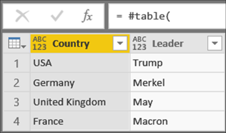
Before diving into the treemap design process, it is crucial to gather and prepare the relevant data. Identify the data sources that contain the information you want to visualize. Ensure the data is clean, consistent, and properly formatted for seamless integration with Power BI.
Choosing the Right Data for a Treemap

Once you have the data in hand, consider its hierarchies and categories. Treemaps excel at showcasing hierarchical relationships, so choose data that lends itself well to treemap visualization. Identify the variables that will best convey the hierarchy and relationships within the data. This step is essential for creating a treemap that tells a compelling story.
Designing the Treemap Layout
Power BI offers various layout algorithms for treemaps, such as squarified, slice-and-dice, and strip. Familiarize yourself with these layout options and choose the one that suits your data and storytelling goals. Additionally, customize the appearance of the treemap by selecting colors, fonts, and other visual elements that align with your brand or message.
Adding Interactivity and Drill-Down Functionality
To make your treemap interactive and engaging, leverage the power of Power BI’s drill-down functionality. Allow users to explore different levels of detail within the treemap by enabling drill-down actions. This feature enables a more dynamic storytelling experience, empowering users to dive deeper into the data and discover insights on their own.
Applying Color and Size Encoding
Color and size encoding are powerful techniques for conveying information in a treemap. Use colors strategically to represent different categories or data values, ensuring clarity and easy interpretation. Assign appropriate size encoding to accurately reflect the magnitude or importance of the data points within the treemap.
Enhancing the Storytelling Element

While treemaps are visually captivating on their own, adding annotations and text boxes can enhance the storytelling element. Provide context, explanations, and narrative elements within the treemap to guide your audience through the data story. These annotations can highlight key findings, share additional insights, or provide relevant background information.
Sharing and Publishing the Treemap
Once your treemap design is complete, it’s time to share and publish it for wider audience access. Export the treemap as an image or include it in presentations and reports. You can also leverage Power BI’s online publishing capabilities to share the interactive treemap with colleagues, clients, or the public.
Best Practices for Designing Stunning Treemaps
To ensure your treemap captivates and effectively communicates insights, consider the following best practices:
Keep the treemap visually appealing and clutter-free.
Use appropriate color schemes that are accessible and intuitive.
Avoid overcrowding the treemap with excessive data points or labels.
Provide clear legends and explanations for color and size encoding.
Test the treemap on different devices and screen sizes to ensure optimal viewing experience.
Real-World Examples of Treemap Storytelling
Numerous organizations have successfully utilized treemaps in their data storytelling efforts. For instance, a retail company might use a treemap to showcase product sales by category, allowing stakeholders to quickly identify top-performing products. A financial institution could use a treemap to visualize market share among different investment portfolios. These real-world examples demonstrate the versatility and impact of treemaps in telling data-driven stories.
Conclusion
Mastering the art of storytelling with data through treemap design can elevate your data visualization skills and captivate your audience. By understanding the principles of treemaps, choosing the right data, customizing the layout, and enhancing the storytelling elements, you can create stunning treemaps in Power BI that effectively communicate insights. Embrace the power of treemaps and unlock the true potential of your data storytelling.
FAQs

How can treemaps enhance data storytelling?
Treemaps visually represent hierarchical data, making it easier to uncover patterns and relationships. By leveraging treemaps, you can create compelling narratives that engage and educate your audience.
Can I use custom images as part of my treemap design?
Currently, Power BI does not support the use of custom images within treemaps. However, you can use colors and annotations to add visual appeal and context to your treemap.

Is Power BI suitable for beginners in data visualization? Yes, Power BI is suitable for beginners in data visualization. Power BI offers a user-friendly interface and intuitive features that make it accessible to users of all skill levels. The platform provides a wide range of pre-built visualization options, including treemaps, which can be easily customized and tailored to your specific needs. Additionally, Power BI offers extensive documentation, tutorials, and a supportive community that can help beginners navigate the intricacies of data visualization and make the most out of the tool.
Are there any alternative tools for creating treemaps?
While Power BI is a popular choice for creating treemaps, there are other data visualization tools available that offer treemap functionality. Some notable alternatives include Tableau, QlikView, and Google Data Studio. Each tool has its own strengths and features, so it’s important to explore and find the one that best suits your requirements and preferences.
Can I apply treemap visualization to live data sources?

Yes, treemap visualization can be applied to live data sources in Power BI. By connecting Power BI to live data feeds or databases, you can create dynamic treemaps that update in real-time as the data changes. This functionality allows you to explore and analyze the most up-to-date information, providing valuable insights to inform decision-making.